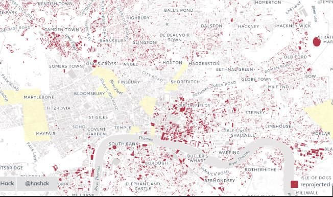
Integrating data visualization on maps is a powerful way to represent complex datasets in an intuitive and interactive manner. Maps provide a spatial context to data, making it easier to identify patterns, trends, and insights that may not be apparent in traditional charts or tables. By leveraging modern JavaScript libraries and APIs, developers can create dynamic and visually appealing map-based visualizations that enhance user engagement and comprehension.

Using Leaflet for Interactive Maps
Leaflet is a popular open-source JavaScript library for creating interactive maps. It is lightweight, easy to use, and supports a variety of map layers and controls. With Leaflet, developers can integrate different types of data visualizations, such as heatmaps, choropleth maps, and marker clusters. These visualizations help in displaying data density, distribution, and intensity across geographical areas. Leaflet’s extensive plugin ecosystem allows for additional functionalities like drawing tools, geocoding, and animated markers, making it a versatile choice for map-based data visualization.
Leveraging D3.js for Custom Visualizations
D3.js is a powerful JavaScript library for producing dynamic, data-driven visualizations. It allows developers to bind data to the Document Object Model (DOM) and apply data-driven transformations to the document. When combined with mapping libraries like Leaflet or Google Maps, D3.js can be used to create custom visualizations such as proportional symbols, path animations, and geo-spatial data overlays. This combination provides a high degree of customization and flexibility, enabling the creation of unique and informative map visualizations.
Visualizing Data with Google Maps API
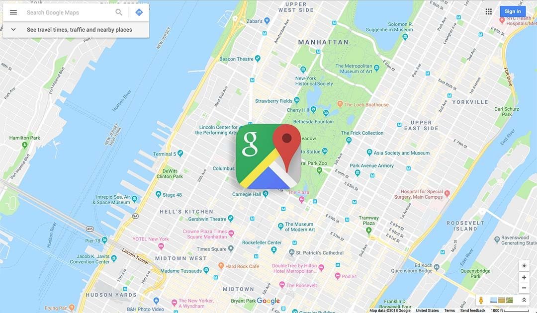
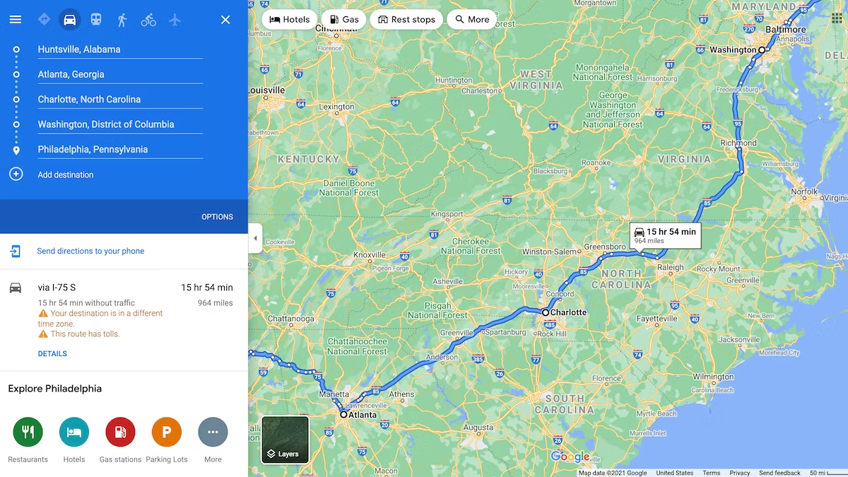
Google Maps API offers a robust set of tools for integrating data visualizations into maps. It supports various visualization types, including heatmaps, marker clustering, and custom map styling. The HeatmapLayer feature allows developers to visualize the density of data points, which is particularly useful for displaying large datasets like crime reports, social media check-ins, or traffic incidents. Google Maps API’s extensive documentation and support make it a reliable choice for adding sophisticated visualizations to your maps.
Integrating Mapbox for Advanced Visualizations
Mapbox is another powerful platform for creating advanced map visualizations. It provides a rich set of features, including custom vector tiles, real-time data integration, and 3D maps. Mapbox GL JS, the JavaScript library for interactive, customizable maps, supports high-performance rendering and smooth animations, making it ideal for visualizing large datasets and real-time data streams. Developers can use Mapbox Studio to design custom map styles and integrate data layers, enhancing the overall visual appeal and functionality of the map.
Combining Data Sources for Comprehensive Insights
One of the key benefits of map-based data visualization is the ability to combine multiple data sources to gain comprehensive insights. For instance, combining demographic data with economic indicators can provide a deeper understanding of regional disparities. Similarly, integrating weather data with traffic patterns can help in predicting and managing congestion. By overlaying various data layers on a map, users can interactively explore relationships and correlations between different datasets, leading to more informed decision-making.
Enhancing User Interaction and Experience
Interactive map visualizations significantly enhance user engagement by allowing users to explore data in a spatial context. Features such as zooming, panning, and tooltips provide an immersive experience, enabling users to drill down into specific areas and gain detailed insights. Interactive legends and filters allow users to customize the visualization according to their preferences, making it easier to focus on relevant data points. These interactive elements not only improve the user experience but also make the data more accessible and understandable.
Conclusion
Data visualization on maps is an effective way to present complex data in an intuitive and engaging manner. By utilizing JavaScript libraries and APIs such as Leaflet, D3.js, Google Maps API, and Mapbox, developers can create dynamic and visually appealing map-based visualizations. These visualizations enhance user interaction and provide valuable insights by representing data in a spatial context. Combining multiple data sources and integrating interactive features further enriches the user experience, making map-based data visualization a powerful tool for data analysis and presentation.


