


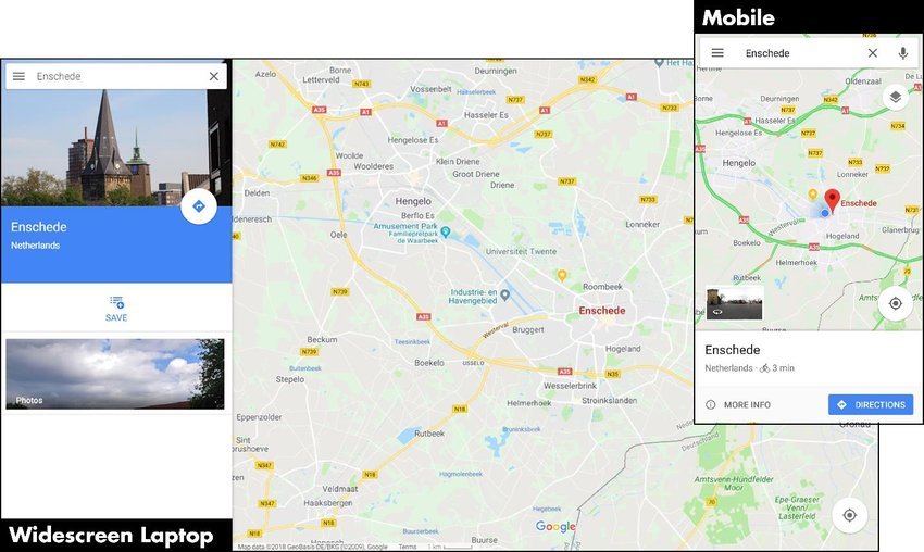
Creating responsive maps is essential for ensuring that users have a seamless experience on mobile devices. A responsive map adjusts its size and functionality based on the screen size and orientation, providing an optimal viewing experience. This guide will walk you through the steps to create responsive maps using the Google Maps JavaScript API, including layout adjustments, touch interactions, and best practices for mobile optimization.
Step 1: Set Up Your Google Maps JavaScript API
Before making your map responsive, ensure you have the Google Maps JavaScript API set up:
- Obtain an API Key
- Go to the Google Cloud Console.
- Create or select a project.
- Enable the Maps JavaScript API and generate an API key.
- Include the API in Your HTML
- Add the following script tag to your HTML file to include the Google Maps JavaScript API:
html
<script src="https://maps.googleapis.com/maps/api/js?key=YOUR_API_KEY&callback=initMap" async defer></script>
- Replace
YOUR_API_KEYwith your actual API key.
- Add the following script tag to your HTML file to include the Google Maps JavaScript API:
Step 2: Create the Basic HTML Structure
- Set Up Your HTML File
- Create an HTML file with a container for the map and responsive design elements:
html
<!DOCTYPE html>

<html lang="en">

<head>

  <meta charset="UTF-8">

  <meta name="viewport" content="width=device-width, initial-scale=1.0">

  <title>Responsive Map</title>

  <style>

    body {

      margin: 0;

      padding: 0;

      overflow: hidden;

    }

    #map {

      height: 100vh; /* Full viewport height */

      width: 100vw;  /* Full viewport width */

    }

  </style>

</head>

<body>

  <div id="map"></div>

  <script>

    function initMap() {

      const map = new google.maps.Map(document.getElementById('map'), {

        center: { lat: 40.730610, lng: -73.935242 },

        zoom: 12

      });

    }

  </script>

</body>

</html>
- The
#mapdiv is set to occupy the full height and width of the viewport.
- Create an HTML file with a container for the map and responsive design elements:
Step 3: Make the Map Responsive
- Adjust Map Size Dynamically
- Ensure that the map container resizes correctly when the viewport changes. Using
height: 100vhandwidth: 100vwensures that the map takes up the full viewport.
- Ensure that the map container resizes correctly when the viewport changes. Using
- Handle Different Screen Sizes
- The
metaviewport tag in the HTML ensures that the map scales properly on mobile devices:html<meta name="viewport" content="width=device-width, initial-scale=1.0">
- The
- Use CSS Media Queries
- Apply CSS media queries to adjust the map’s appearance for different screen sizes. For example:
css
@media (max-width: 600px) {

  #map {

    height: 50vh; /* Adjust height for smaller screens */

  }

}
- Apply CSS media queries to adjust the map’s appearance for different screen sizes. For example:
Step 4: Optimize for Touch Interactions
- Enable Touch Interactions
- Google Maps API supports touch interactions out-of-the-box. Ensure that touch gestures like pinch-to-zoom and swipe-to-pan are functioning properly.
- Test on Mobile Devices
- Test your map on actual mobile devices to ensure that touch interactions work smoothly and that the map is easily navigable.
Step 5: Enhance Mobile User Experience
- Optimize Loading Performance
- Minimize the amount of data loaded initially. Use techniques such as lazy loading to improve map performance on mobile devices.
- Design for Interactivity
- Make sure that map controls and markers are easily clickable and accessible on touch screens. Increase button sizes if necessary to improve usability.
- Provide Clear Information
- Ensure that any information presented on the map (such as markers or pop-ups) is legible and easy to interact with on smaller screens.
Step 6: Implement Map Controls and UI Elements
- Custom Controls
- Add custom controls or overlays to enhance functionality. For instance, you can create a button to switch between map views or to center the map on a specific location.
javascriptconst centerControlDiv = document.createElement('div');
const centerControl = new CenterControl(centerControlDiv, map);function CenterControl(controlDiv, map) {
const controlUI = document.createElement('div');
controlUI.style.backgroundColor = '#fff';
controlUI.style.border = '2px solid #fff';
controlUI.style.borderRadius = '3px';
controlUI.style.boxShadow = '0 2px 6px rgba(0,0,0,0.3)';
controlUI.style.cursor = 'pointer';
controlUI.style.margin = '10px';
controlUI.style.textAlign = 'center';
controlUI.title = 'Click to recenter the map';
controlDiv.appendChild(controlUI);const controlText = document.createElement('div');
controlText.style.fontFamily = 'Roboto,Arial,sans-serif';
controlText.style.fontSize = '16px';
controlText.style.lineHeight = '38px';
controlText.style.paddingLeft = '5px';
controlText.style.paddingRight = '5px';
controlText.innerHTML = 'Center Map';
controlUI.appendChild(controlText);controlUI.addEventListener('click', () => {
map.setCenter({ lat: 40.730610, lng: -73.935242 });
});
}
- Responsive Design for Controls
- Ensure that custom controls and UI elements are also responsive and adapt to various screen sizes.
Step 7: Test and Refine
- Cross-Browser Testing
- Test the responsive map across different browsers and devices to ensure consistent performance and appearance.
- User Feedback
- Gather feedback from users to identify any usability issues and make improvements based on their input.
- Update Regularly
- Keep your map and its features updated to accommodate changes in device screen sizes, operating systems, and user preferences.
Conclusion
Creating responsive maps is crucial for providing a smooth and engaging experience for users across various devices. By setting up your Google Maps JavaScript API, adjusting map size dynamically, optimizing for touch interactions, and implementing custom controls, you can ensure that your map performs well on mobile devices. Follow best practices for responsive design and continuously test and refine your implementation to deliver a top-notch user experience.