Google Maps Data Visualization is a powerful tool for displaying geographic data in an interactive and meaningful way. In this article, we’ll explore various methods to effectively implement Google Maps Data Visualization on your website or application. Whether you’re visualizing sales data, tracking assets, or displaying demographic information, leveraging the capabilities of Google Maps can enhance the understanding and usability of your data.
Understanding Google Maps Data Visualization
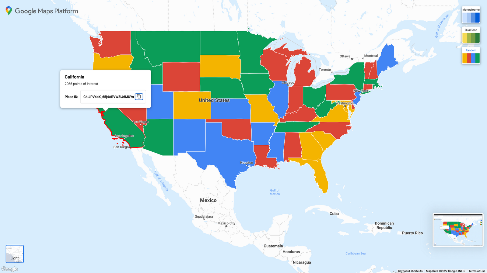
Google Maps Data Visualization refers to the process of presenting data points or statistical information on a map interface. This technique allows users to interact with data visually, making it easier to identify patterns, trends, and insights based on geographic locations.
Using Markers for Point Data
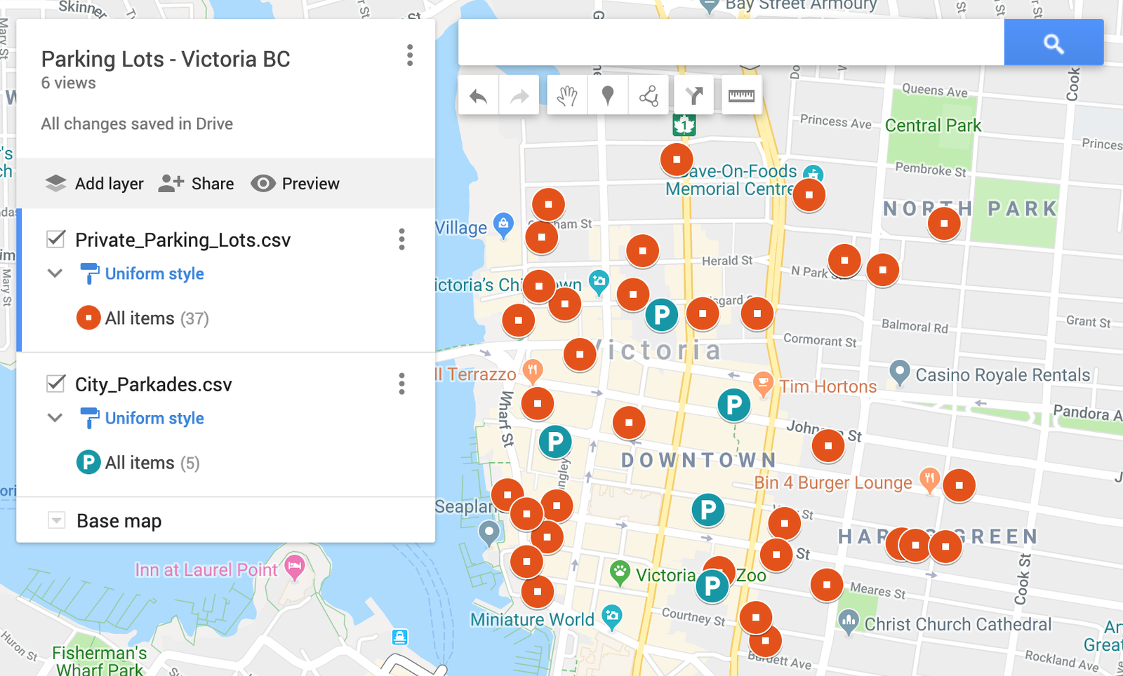
Markers are one of the simplest and most common ways to visualize point data on Google Maps. Each marker represents a specific location or data point, such as customer locations, store branches, or event venues. Customize markers with different colours, icons, or labels to convey additional information at a glance.
Heatmaps for Density Representation
Heatmaps are effective for visualizing the density and distribution of data points across a geographic area. They use colour gradients to indicate areas with a high concentration of data points, helping users quickly understand hotspots or patterns within the dataset. Heat maps are useful for visualizing population density, crime rates, or traffic volume.
Polygons and Polylines for Areas and Routes
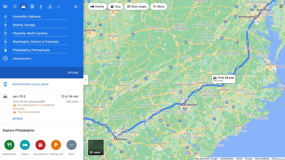
Polygons and polylines are ideal for displaying data that covers specific geographic areas or follows routes. Use polygons to outline regions such as sales territories or administrative boundaries. Polylines, on the other hand, connect multiple points to illustrate routes, navigation paths, or movement patterns over time.
Info Windows for Detailed Information
Info windows provide additional context and detailed information when users interact with markers or other map elements. Customize info windows to display text, images, or interactive content related to each data point. This feature is useful for displaying customer details, property information, or event descriptions.
Custom Map Styles and Themes
Customize the appearance of Google Maps to match your brand or highlight specific data visualization elements. Use the Google Maps JavaScript API to create custom map styles, adjust colours, and emphasize important features. A visually appealing map enhances user engagement and reinforces the relevance of displayed data.
Integration with External Data Sources
Integrate Google Maps Data Visualization with external data sources such as databases, APIs, or real-time feeds to ensure your map reflects the latest information. Use JavaScript frameworks like React or Angular to fetch and dynamically update data on the map, providing users with current insights.
Clustering for Large Datasets
When dealing with a large number of data points, clustering helps improve map performance and usability. Cluster markers together based on proximity to simplify the map view and prevent overcrowding. Users can then interact with clusters to zoom in and explore individual data points within specific areas.
Geocoding and Reverse Geocoding
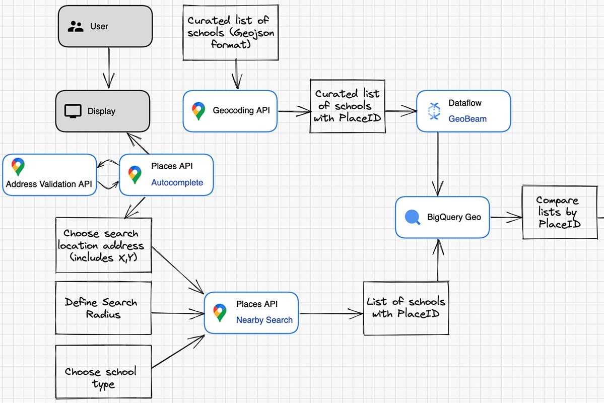
Geocoding converts addresses or place names into geographic coordinates (latitude and longitude), enabling accurate data placement on the map. Reverse geocoding, on the other hand, translates coordinates back into readable addresses. These functionalities are essential for precise data visualization and location-based services.
Mobile Optimization
Ensure your Google Maps Data Visualization is responsive and optimized for mobile devices. Consider mobile-specific interactions and design elements to provide a seamless user experience across different screen sizes and resolutions. Responsive maps enhance accessibility and usability for mobile users.
Accessibility Considerations
Make your Google Maps Data Visualization accessible to all users, including those with disabilities. Provide alternative text for map images, ensure keyboard navigation support, and consider colour contrast for visually impaired users. Accessibility enhancements improve usability and compliance with accessibility standards.
Collaborative Mapping Features
Enable collaborative features that allow multiple users to interact with and contribute to the map simultaneously. Implement real-time updates, comments, or annotations to facilitate collaboration among team members or stakeholders. Collaborative mapping enhances communication and decision-making processes.
Data Security and Privacy
Protect sensitive data displayed on Google Maps by implementing robust security measures. Data security measures safeguard user information and maintain trust.
Conclusion
In conclusion, Google Maps Data Visualization offers diverse opportunities to present geographic data effectively and engage users with interactive visualizations. By implementing these techniques, you can create compelling maps that enhance understanding, facilitate decision-making, and provide valuable insights for your audience.


